
HEDS colleagues Allan Wailoo, Monica Hernandez and Steve Pudney have written for the Blog tackling the question “Why does my mapping
not predict health utilities at 1?”
We get this question a lot. So often in fact that we’ve
decided to write a blog post about it. You’ve done a mapping study, running a
model of, say, EQ5D (3 level) health utilities as a function of some disease
specific patient reported outcome (PRO) measure. But when you predict utilities
for patients from your model, none of those predictions are equal to 1. Even
for patients that say they have no problems on the PRO, the model still doesn’t
predict 1. Yet in the data you used to estimate your model you can see that
loads of patients say they are in full health. This must be a pretty poor model
if it is so different to the data, right? WRONG!
The prediction is the conditional mean (conditional on the
predictors). It tells us, for a set of patient covariates, what we think EQ5D
would be on average. It does not say that we think every patient with those
characteristics will respond with that score. It might be the case that none of
them do. There’s no reason why that mean even corresponds to any of the 243
scores for the EQ5D 3L health states. And if you look in your data, you will
almost certainly find that there is no set of patients that give the same responses
to the PRO, even those telling you that there is nothing wrong with them, where
they all say that there is nothing wrong with them on the EQ5D. That’s just the
nature of patient level data – there’s lots of variability. The prediction
averages out the unpredictable part of the variation.
So when you plot the predictions, that’s not going to bear
any resemblance to the distribution of the original data. The data will look something
like the left of this plot and the predictions will look like the right, even
if the model fits like a glove.
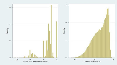
Comparing these plots is comparing apples with oranges.
Either compare the conditional mean EQ5D seen in the data with the conditional
means from the model (the predictions), or simulate data from your model by reference
to the error term(s) and compare that to the data.
This point is made repeatedly in our mapping papers, and in
the ISPOR Good Practice Guide (ref ViH 2017). But whilst this might all seem obvious,
we keep seeing published mapping studies, and claimed “validations” of mapping
results, that confuse these issues.